# [Usage](../../usage.md) > [UI](basics.md) > Navigation
---
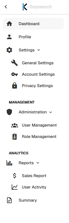
You can configure the navigation in `config\k-framework\navigation.php`, following the structure:
```php
['button_text', 'icon', 'url', 'parent_group', 'parent_button', ordering_number]
```
- `button_text` -> The effective text of the button entry.
- `icon` (string) -> Material design icon suffix, example: 'home' -> will be transformed into 'mdi-home'.
- `url` (string) -> The link to which the button should redirect on click, can also be null.
- `parent_group` (string) -> Title of the group, if defined, these buttons will be grouped in the same group.
- `parent_button` (string) -> Text of the parent button, used to create submenus. Is advised to place the parent button 'url' on null.
- `ordering_number` (integer) -> Defines the order of the button, buttons will be organized in ascending order, if no parent group, the button will follow a general order, if parent group will be ordered between the other buttons of the group, if parent button will be ordered between the sub-buttons of the parent.
An example of the menu above:
```php
```
the navigation is already included.
Otherwise, you can add it to a page using:
```html
```
Remember to include a button or a icon to open/close the navbar, it is absolutely necessary in phone navigation:
```html
```
This is an example, is only necessary that has the class `kfw-navbar-toggle`.
Config key / file: `config/k-framework/navigation.php` (array of `['button_text', 'icon', 'url', 'parent_group', 'parent_button', ordering_number]` entries, kept above). Minimal Blade/config example:
```php
// config/k-framework/navigation.php
return [
['Dashboard', 'home', '/', null, null, 1],
['Settings', 'cog', null, null, null, 2],
['General Settings', 'wrench', '/settings/general', null, 'Settings', 1],
];
```
```html
```
### Headbar and navbar configuration
The shell layout is configured in `config/k-framework/ui.php`:
```php
'headbar' => [
'enabled' => true,
],
'navbar' => [
'enabled' => true,
'compressed' => false,
'orientation' => 'vertical',
'default_open' => true,
],
```
- `headbar.enabled` enables the top headbar. When disabled, the headbar is not rendered: the logo moves to the top of the navbar, the headbar buttons are displayed in the navbar, the navbar toggle is placed in the content header next to the page title, and the page title is always displayed in the page.
- `navbar.enabled` enables the navigation bar and its toggle control.
- `navbar.compressed` reduces a vertical navbar to icons, expanding on hover.
- `navbar.orientation` accepts `vertical` or `horizontal`. With the headbar disabled, the horizontal navbar is rendered as a compact top bar hosting the logo, the menu and the headbar buttons.
- `navbar.default_open` sets the initial visibility on desktop. Mobile view always starts hidden and provides a close control inside the navbar.
See also: [basics](basics.md), [logo](logo.md), [theming](theming.md), [light/dark mode](dark_mode.md).